


How to use heatmap analytics manufacturing leaders trust to improve material flow across multiple sites in 2026
If you run more than one plant, you already know the hardest question to answer is also the simplest: where do materials, people, and work-in-process actually move, wait, and stall on the floor? Productivity data shows the stakes are uneven. Output per hour increased in only 41 of 85 manufacturing and mining industries in 2025, which means nearly half saw flat or declining efficiency (Source: U.S. Bureau of Labor Statistics). Meanwhile, costs are rising and employment is falling, pushing leaders to optimize the plants they own rather than build new ones (Source: Deloitte 2026 Manufacturing Industry Outlook). This guide gives you a decision framework for evaluating heatmap analytics across a network, what data to examine, how to compare architectures, and how to tie findings to OEE and continuous improvement.
Key takeaways
- Manufacturing heatmap analytics turn movement density, dwell time, and route variance into visual patterns you can compare across plants, lines, and shifts.
- The most useful heatmap data ties directly to constraints: queue buildup, line-side congestion, staging behavior, and SOP deviations near your bottleneck steps.
- Architecture matters: hybrid edge-to-cloud designs balance real-time floor visibility with cross-site benchmarking and easier integration with MES, ERP, and CMMS.
- Heatmap findings become operational wins only when linked to OEE, throughput, WIP, and changeover metrics inside daily management routines.
- Evaluate any approach on camera compatibility, deployment speed, governance, and total cost of ownership before committing to a network rollout.
What manufacturing heatmap analytics actually measure
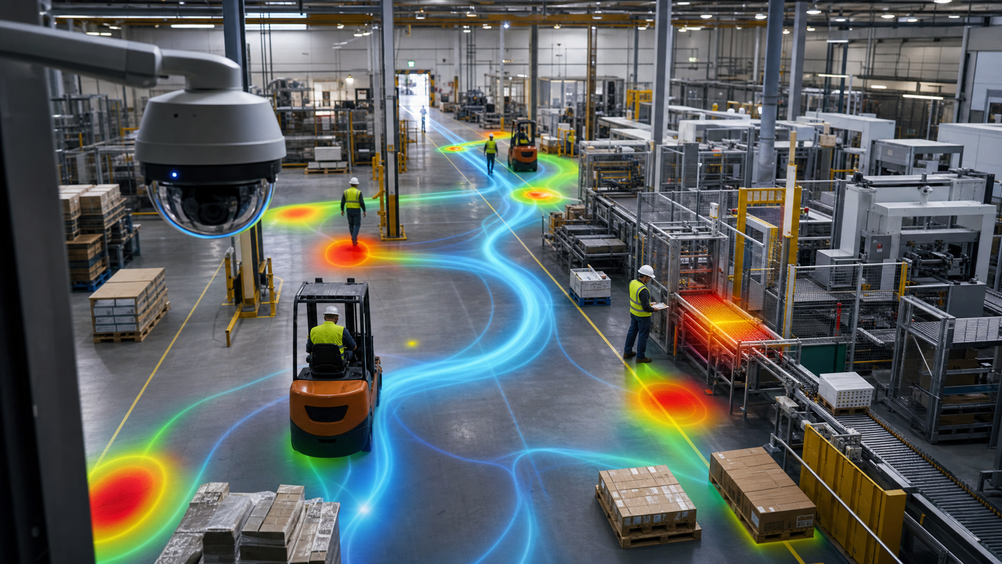
Manufacturing heatmap analytics convert continuous floor activity into a visual map of where movement concentrates and where it slows. Instead of a one-time spaghetti diagram drawn during a single observation window, a heatmap captures movement density, dwell time, and traffic patterns across every shift, every day. That distinction matters because variability hides in the gaps between studies.
Video AI for manufacturing makes this practical without new instrumentation. The cameras most plants already own become a data source that surfaces forklift and cart traffic, staging-area congestion, WIP accumulation, and route inefficiencies. The research base supports the underlying logic. A LACCEI 2025 study that optimized reception dwell time with lean techniques reported a 17% productivity increase and an 80% reduction in outsourced material after implementation (Source: LACCEI 2025).
Heatmaps do not replace your judgment. They give you a consistent lens.
The data points worth examining first
When you review a production line heatmap or warehouse material flow analytics, prioritize the metrics that connect to a known constraint. Key data points to examine include:
- Movement density: where people, vehicles, or materials concentrate relative to productive activity.
- Dwell time: how long pallets, carts, or WIP remain in a zone before moving.
- Route variance: how actual paths diverge from the standard route defined in your SOP.
- Queue buildup: where lines of carts or containers form at staging and line-side replenishment points.
- Zone utilization: how intensively each area is used across hours and shifts.
- Shift-to-shift variance: how the same metrics differ between your best and worst shifts.
McKinsey operations research argues that bottlenecks often arise from coordination and material-handling practices, not intrinsic machine capacity (Source: McKinsey Operations Insights). A corridor that shows intense movement and long dwell can be a hidden bottleneck even when no nearby machine looks overloaded.
How factory heatmaps surface production bottlenecks and dwell-time issues
Traditional lean tools like value stream mapping and spaghetti diagrams capture a snapshot. They can miss the drift that creeps in across product changes, staffing shifts, and seasonal demand. Factory floor analytics built on continuous video keep the picture current, so production bottleneck detection becomes a routine, not a special event.
Heatmap clustering is what makes recurring problems jump out. A 2025 Scientific Reports study used heatmap clustering to analyze yield and growth across nine genotypes over three seasons, revealing patterns that raw tables obscured (Source: Scientific Reports (Nature)). The same technique applied to a factory groups zones with similar behavior, so you can see that a particular staging area consistently runs long dwell on second shift, or that one inspection station accumulates WIP on certain product families.
For a busy operator, the workflow is straightforward. Examine zones where movement density is high but productive activity is low. Flag dwell times that exceed target thresholds. Watch for route variance where forklifts take longer paths to avoid congestion, which quietly extends cycle time. Each of these is a candidate for a targeted experiment in layout, staffing, or SOP revision.
Comparing analytics approaches and architectures for multi-site visibility
Most multi-site manufacturing analytics decisions come down to where processing happens and how data moves across the network. With construction spending declining and capital constrained, leaders increasingly retrofit existing facilities rather than build bespoke architecture from scratch (Source: Deloitte 2026 Manufacturing Industry Outlook). That reality favors approaches that reuse your current cameras and networks.
The table below compares common architectures against the criteria a VP of Operations weighs. Spot AI's hybrid edge-to-cloud approach appears as one column for reference, not as a foregone conclusion.
| Decision criterion | Centralized cloud | On-premises only | Hybrid edge-to-cloud (Spot AI approach) |
|---|---|---|---|
| Real-time floor responsiveness | Network latency can delay alerts | Low latency, strong local response | Edge handles timely detection, cloud handles heavier analysis |
| Cross-site benchmarking | Strong, all data aggregated centrally | Limited without added integration work | Strong, metadata aggregates for network views |
| Bandwidth and video governance | High bandwidth, full video leaves the site | Video stays local, low external exposure | Full-resolution video stays on-prem, only metadata leaves |
| Camera compatibility | Varies by platform | Varies by platform | Camera-agnostic, works with existing IP cameras |
| Deployment speed | Faster software setup, heavier network load | Longer hardware provisioning | Most sites live in days, no rip-and-replace |
No single architecture wins on every axis. McKinsey research recommends choosing based on business objectives, end-to-end data flow, governance, and scalability rather than IT preference alone (Source: McKinsey Operations Insights). For network-wide material flow analytics, hybrid designs tend to balance the competing demands of real-time visibility and cross-site benchmarking.
A second comparison: point tools versus a unified platform
Beyond where processing runs, weigh how the analytics fit your existing systems. Point solutions deliver one chart well but rarely connect to OEE, scheduling, or maintenance. A unified operations platform connects heatmap insights to MES, ERP, and CMMS, so a congestion pattern can be traced to a scheduling decision or a maintenance gap. The same tradeoff applies to manual dashboard review versus AI-assisted investigation. Reviewing hours of footage by hand does not scale across plants. AI assistance lets a team ask what changed between the best and worst shift without scrubbing video.
Connecting heatmap insights to OEE, SOP adherence, and continuous improvement
A heatmap that nobody acts on is decoration. The value shows up when visual flow data sits beside your numeric metrics inside daily management. Deloitte research notes that real-time analytics drive efficiency only when embedded into operational workflows, supported by governance and people who can interpret them (Source: Deloitte 2025 Smart Manufacturing Survey).
Here is a practical way to fold heatmap analytics into existing routines:
- Daily OEE huddles: pair each shift's OEE review with a heatmap of the same window to see whether low performance lines up with a congestion pattern.
- Gemba walks: use the densest movement and longest dwell zones to direct where leaders observe in person and talk with operators.
- Kaizen events: generate problem statements from heatmap evidence, then compare pre- and post-change flow to validate the fix.
- SOP adherence checks: compare actual routes and staging against the standard, and treat deviations as process-design signals rather than blame.
- Cross-site benchmarking: identify the plant or shift with the cleanest flow pattern, then codify that practice as a repeatable SOP across the network.
This is where an AI operations assistant earns its keep. It watches every run, evaluates it against your SOPs, and flags drift with the video clip attached, so teams adjust on the fly instead of waiting for a monthly report. The goal is not to police people. It is to find and standardize the best shift.
Key terms
- Dwell time: how long materials, carts, or WIP remain in a zone before moving to the next step.
- Route variance: the degree to which actual movement paths diverge from the standard route defined in an SOP.
- OEE: overall equipment effectiveness, a composite of availability, performance, and quality.
- Process drift: the gradual departure of a running process from its standardized best practice over time.
What a multi-site rollout looks like in practice
One $12B global manufacturer applied Spot AI's AI Operations Assistant to its changeover process, a classic source of hidden capacity. The system watches and evaluates 100% of changeovers, roughly 20 per day, and generates immediate report cards with action items. It flags process deviations on every run with video clips so teams can correct in the moment.
A $12B global manufacturer used Spot AI's AI Operations Assistant to reduce changeover time on production lines, with a customer-reported 15% reduction in changeover time in the first 3 weeks. The customer's goal was to reduce changeover time by 50%, with a path to up to $200M in annual recovered revenue.
That early result came without a rip-and-replace project, because the platform works with the cameras already on the floor. The same approach extends across changeovers, loading, and line cleaning, which all share a distinct start and end that AI can evaluate against standard work.
A checklist for evaluating heatmap analytics across multiple sites
Before you commit to a network rollout, score each option against criteria that favor durable value. Use this as your evaluation shortlist:
- Camera compatibility: does it run on your existing IP cameras, or does it require new hardware at every site?
- Detection capability: can it reason over movement, dwell, and SOP steps, not just simple motion?
- Historical and real-time views: can teams react now and study trends over weeks?
- Site-to-site benchmarking: can you compare plants and shifts on consistent definitions?
- Integration: does it connect to MES, ERP, CMMS, and quality systems?
- Governance: how is video stored, who can see it, and what leaves the building?
- Deployment speed and total cost of ownership: days or months, and hardware versus subscription tradeoffs.
A pragmatic roadmap follows the same arc. First, pilot on one line or zone with the clearest constraint. Second, benchmark the best and worst shift against consistent definitions. Third, act on the highest-leverage finding and measure the change against OEE and throughput. Fourth, scale the winning practice across sites as a standardized SOP. Each step produces evidence that funds the next.
See how Spot AI approaches material flow visibility
If you are weighing how to turn existing camera data into multi-site material-flow insights, start by seeing how the pieces fit together. Explore how the AI Operations Assistant evaluates every run against your SOPs, then review real customer stories to benchmark what teams in similar environments have reported. The fastest way to pressure-test heatmap analytics manufacturing decisions is to run them against your own video.
Frequently asked questions
What is manufacturing heatmap analytics
Manufacturing heatmap analytics turn continuous floor activity into a visual map of where movement concentrates and where it slows. The data covers movement density, dwell time, queue buildup, and route variance across zones, lines, and shifts. It replaces one-time spaghetti diagrams with an always-current view that surfaces recurring bottlenecks.
How can manufacturers use heatmap analytics to improve material flow across multiple sites
Apply consistent definitions for dwell time, congestion, and route variance to every plant, then compare them side by side. This reveals which site or shift has the cleanest flow pattern. Leaders can codify that pattern into a repeatable SOP and roll it out across the network, then verify with follow-up heatmaps.
What data should operations leaders look for in manufacturing heatmaps
Prioritize data tied to a known constraint: movement density relative to productive activity, dwell time at handoff points, route variance against SOPs, and queue buildup at staging and line-side areas. Connect those patterns to outcomes like throughput, OEE, WIP levels, and quality. The aim is diagnosis, not just visualization.
What is the best architecture for multi-site heatmap analytics in manufacturing
There is no universal answer, but hybrid edge-to-cloud designs tend to balance the competing needs well. The edge handles timely floor detection while the cloud handles cross-site benchmarking and heavier analysis. McKinsey research advises choosing based on business objectives, data flow, governance, and scalability rather than IT preference alone (Source: McKinsey Operations Insights).
How do heatmap analytics connect to OEE and continuous improvement
Heatmaps add a visual counterpart to numeric metrics inside daily management. Pair them with OEE huddles, Gemba walks, and Kaizen events so congestion patterns and SOP deviations become problem statements with evidence. Deloitte research notes that real-time analytics drive efficiency only when embedded into operational workflows with supporting governance and talent (Source: Deloitte 2025 Smart Manufacturing Survey).
About the author
Sud Bhatija is COO and Co-founder at Spot AI, where he scales operations and GTM strategy to deliver video AI that helps operations, safety, and security teams boost productivity and reduce incidents across industries.


.png)
.png)
.png)
.svg)