


-min.png)
Published in Bootcamp by UX Collective, the largest design publication on Medium
Introduction
This year, I joined a startup called Spot AI and was tasked with building out their first ever Design System. After many months of hard work, I’m proud to say that Spot now boasts a newly redesigned platform built using its very own, custom Design System. It is without a doubt one of the biggest achievements of my design career thus far, and I learned a lot along the way.
One thing I discovered early on was that there’s surprisingly little practical information online about building a Design System. I found ten-part YouTube tutorials on crafting complex, state-of-the-art Figma component libraries, and glossy posts from big design teams explaining how they maintain their million-component systems. But what I really needed was something different — a clear, realistic framework to creating a Design System from scratch, with a small team and just a few short weeks to pull it off.
I feel like a lot of product designers find themselves in this situation. So when this project came to an end, I decided to put together my own little guide, based on everything I’ve learned over the past few months.
Step 1: Create a moodboard that’s actually useful
If your startup already has their visual language figured out, then feel free to skip straight to Step 3 of this guide. However, if you are looking to create or reimagine your product’s UI from the ground up (which is what we did at Spot) you’ll need to start here.
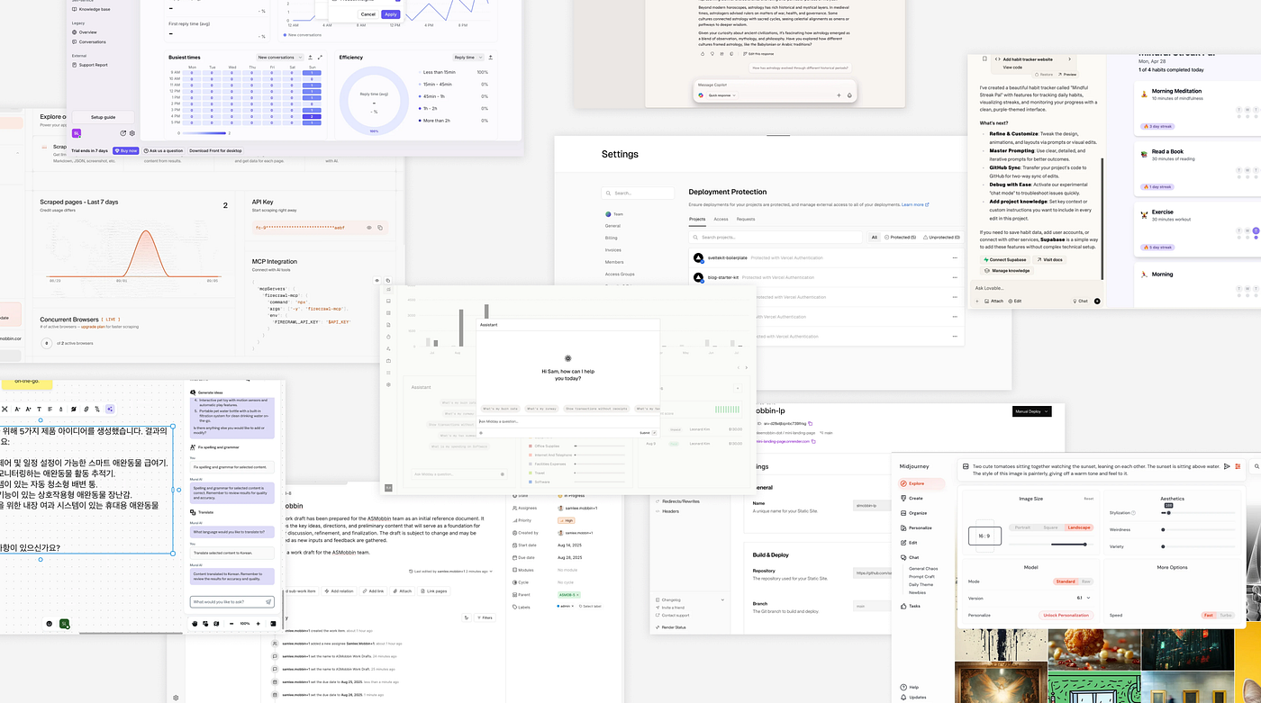
Begin by putting together a collection of realistic UI references — both as inspiration for yourself, and as a tool to use for early alignment with the rest of your team. Now when I say references, I don’t mean the conceptual marketing stuff you find on Dribbble (trust me, I made that mistake) — instead try to find real product screenshots that you can break down and analyze. I highly recommend using a site like Mobbin to find shots of interfaces that were actually shipped and user tested.
Step 2: Get messy in Figma
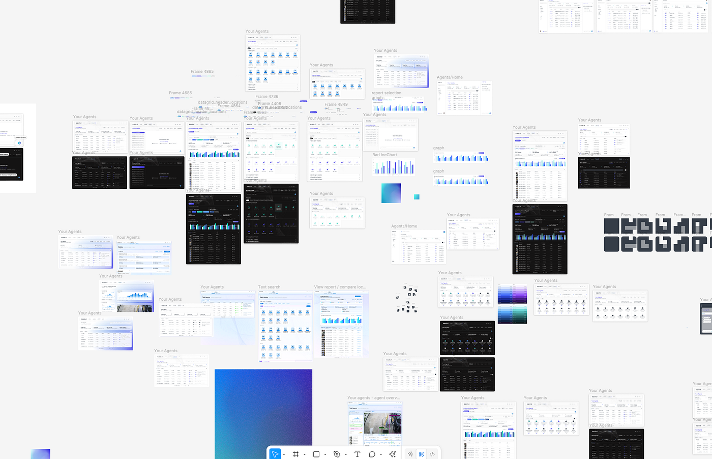
Once you have a sense of the visual direction you would like to go in, start ideating in Figma. Don’t worry about using components or auto layout or anything like that, just focus on iterating quickly and nailing down the exact design style you like.
My advice would be to mock up 3–5 core screens of your product using this new visual language. Once you are happy with how they look, you can share them with the rest of your team and get feedback on it before moving forward (the last thing you want is to have to revise everything after you have already built out the whole system).
Step 3: Rebuild your mockups using Components
Once everyone is aligned on the new design direction, it’s time to properly build out a few product screens using Figma best practices and most importantly, components. These won’t be the exact components you use in your final Design System, but they will help you iron out any inconsistencies or duplicate elements in your product’s design language early on.
Once you have these screens all ironed out, you can move on to the next stage.
Step 4: Partner early with Engineers
Simply put, a true Design System cannot exist without direct collaboration between Design and Engineering. It doesn’t matter how great of a designer you are, you need significant dev resources and buy-in to accurately implement your designs into the product.
For that reason, I recommend reaching out to the engineers you work with as early as possible in the process. In my case, I set up regular weekly check ins with a select group of awesome engineers who were excited about the project, and I collaborated closely with them throughout. Their experience and advice on this next step was especially important.

Step 5: Leverage an existing Component Library
Finding the right components to use as the foundation of your Design System will make things so much easier for both designers and engineers. The good news is that are many incredible open source, unstyled component libraries with built-in interactivity and accessibility that you can completely customize to suit your vision. Here are a few great options you can explore (although I recommend doing your own research here):
- Radix UI
- React Aria
- Base UI
In terms of choosing which one is the right choice for your team, it will come down to which library is:
a) easiest to implement for engineers
b) most closely matches your designs
c) has a corresponding Figma file (this will be a total game changer, so make sure to look for it)
Other things to consider are mobile support, animation capabilities and library size. This is also a good time to find a nice open source icon library to use (again, check for a decent Figma integration to save yourself hassle further down the line).
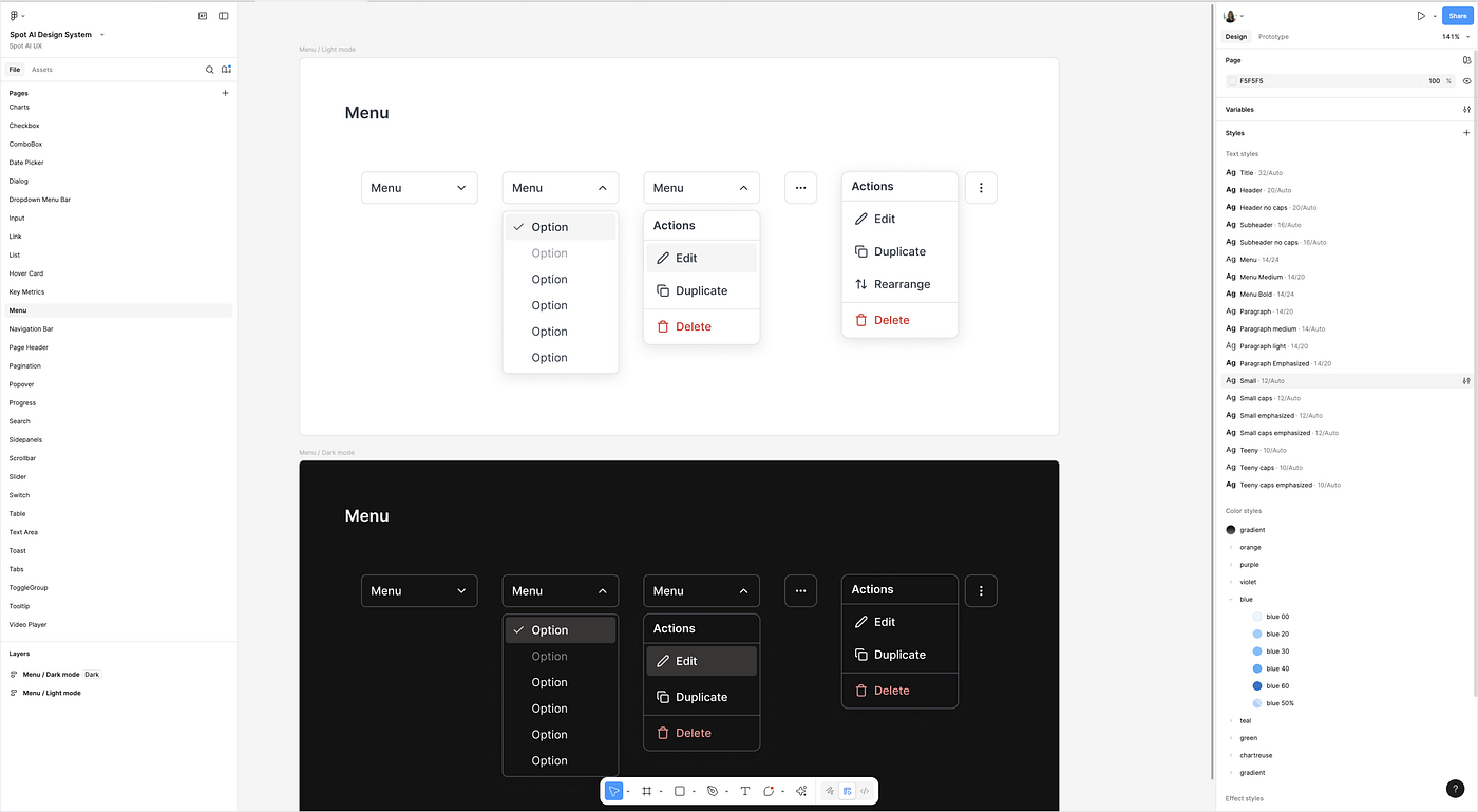
Step 6: Create your Figma Design System
Once you have selected your base component library, it’s time to finally start creating your own Design System in Figma.
Duplicate your library’s Figma file and customize every single style, variable and component to match the visual language and v1 components you made in Step 3. I won’t lie to you, this is a pretty time consuming process and it can be tempting to skip steps— but I promise the effort will pay off! Name frames correctly, create variant states, set up Dark Mode variables — the more care and detail you add at this stage, the more it will set up your designs for success over time. If you have been overseeing this project solo up until now, this is a great team to loop in the entire design team and enlist all the help you can get in building out an extensive list of all required components, across all product features. You will also want to build out a few test screens using these new components, just to make sure everything is looking and working as it should.
Once your Figma Design System is ready, work with Engineering to implement the components in code. If your team is open to using a tool like Storybook (or a similar component library viewer), it’s really worth setting up a shared environment where you can review components as they are built, give design feedback, and ensure everything matches what’s in Figma.

Step 7: Implementation and Upkeep
After your new Design System has been officially set up in both in the Figma and the codebase, it’s time to start building with it! From the design team’s side, it’s essential to make sure all new designs are built using DS components only. You will also have to formally present the Design System to the rest of the EPD team, educate them on how to implement it correctly and most importantly, push for everyone to start using it asap.
If you’re transitioning from an old UI to a new one, it’s also important to have some sort of plan in place for what an interim state might look like. Have a direct conversation with your team about this, and figure out if this UI overhaul can be implemented all in one go or (which was the case with my project) will it have to be introduced more gradually?
Building out the Design System is only the beginning — now you have to put the time into using, maintaining and improving it overtime. In the past few months of working with our new Design System at SpotAI, I’ve changed colors that didn’t look good in the real product, I’ve added new components that I was missing the first time round and I’ve straight up redesigned elements that ended up looking bad in practice. Remember, Design Systems are living, growing systems that are meant to evolve alongside your design vision.
In Conclusion
Building a Design System is one of the most challenging and rewarding things a Product Designer can do. Get ready for weeks of prep work, months of implementation and probably at least one meltdown where you consider scrapping everything and starting from scratch (don’t do it!). If you can get through all of that, I guarantee that it will totally transform your design process and set your whole team up for success as its grows.
A lot of the content we see around UI/UX online is showcasing the work and processes of massive design teams at companies like Apple and Google. Although it’s inspiring to see this, as a startup designer I know how intimidating it can be to feel like you have to achieve that level of design quality, with a fraction of the resources.
That’s why I made this guide — to show every designer how they can craft beautiful, scaleable interfaces. Hopefully this guide will help designers out there to feel empowered to go out and build their own Design System from the ground up.


.png)
.png)
.png)
.svg)